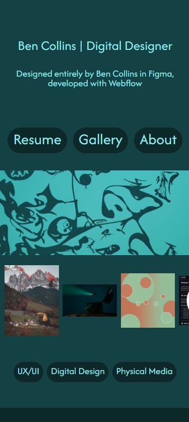
Designed in Figma
Developed with Webflow

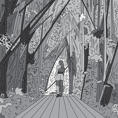
Case Study
Case Study


Case Study
Case Study

Case Study
Case Study


Personal Logotype
Created Using Adobe Illustrator
I set out to design a logo that I could use for personal branding, seeking to create a simple visual identity for my online accounts. I listed traits about myself that I wished to integrate, sketched based on these concepts with my initials, and iterated different ideas many, many times before settling on the final design. Keyword list available here


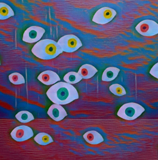
“Point of View”
Paper, String, Cardboard, Tape, Digital Alterations
This project explores the process of iteration and repetition in different formats. It brings to mind questions about perspectives and points of view in everyday life. Are each of these sets of eyes able to see the same reality? Do the differences in color and grouping of the eyes bring any thoughts to mind for you?
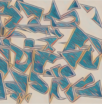
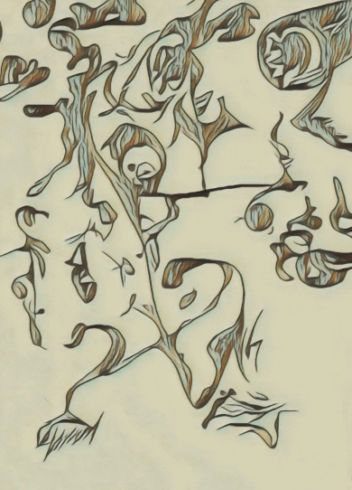
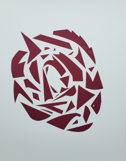
“Fragment Fractures”
Cut paper on bristol board, digitally altered
Cut paper made for a separate art projects was loosely scattered in a truly random way. However, when digitally altered and distorted, it became an artwork of its own. Random shapes began to connect with one another to create interesting patterns, begging the question of whether there is such a thing as random at the finest level.
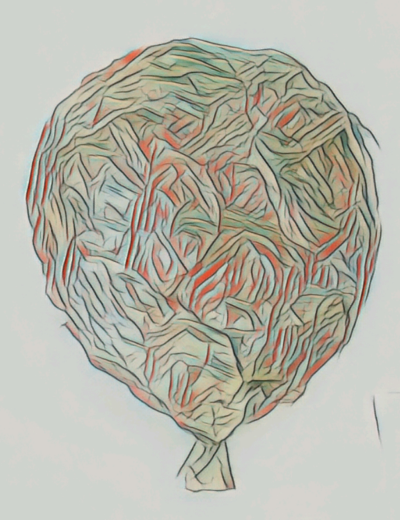
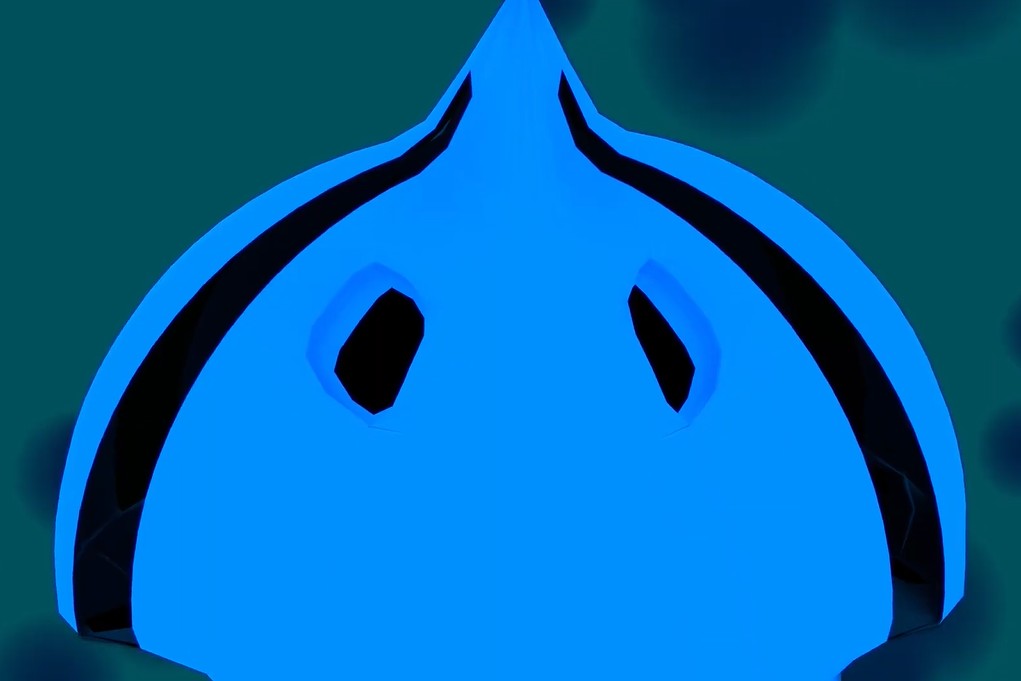
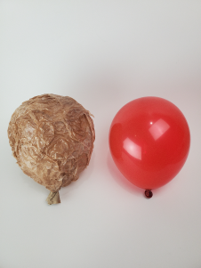
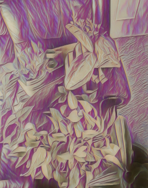
“Membrain”
Plastic bags, paper bags, paper mache, digitally altered
A digitally altered composition based on photography of my Mimic project. This brought a complementary color scheme into the mix and made the folded texture the central focus of the image. I enjoy taking physical projects and converting them into digital media to create interesting virtual assets that I have never seen before.

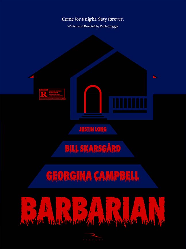
“Barbarian” Poster Design
Made with Adobe Illustrator and Adobe Fonts
I designed a custom minimalist poster for the film "Barbarian" by Ray Bradbury. I incorporated references to key plot points of the movie while constructing a Gestalt composition with an extreme typography. I used minimal elements for maximum impact.

“The Toucan Attack”
Digital Artwork
This project was an exploration of scale and proportion with specific emphasis on absurd size relationships and playful component interaction. I do not claim credit for any of the assets or the image here, this was simply a demonstration of my ability (at the time) with the software and my understanding of perspective, proportion, and how to direct a viewer’s eye.


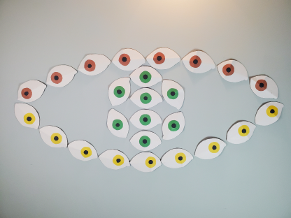


“Point of View”
Cardboard, bristol board, construction paper, tape, fishing wire
This project explores the process of iteration and repetition in different formats. It brings to mind questions about perspectives and points of view in everyday life. Are each of these sets of eyes able to see the same reality? Do the differences in color and grouping of the eyes bring any thoughts to mind for you?
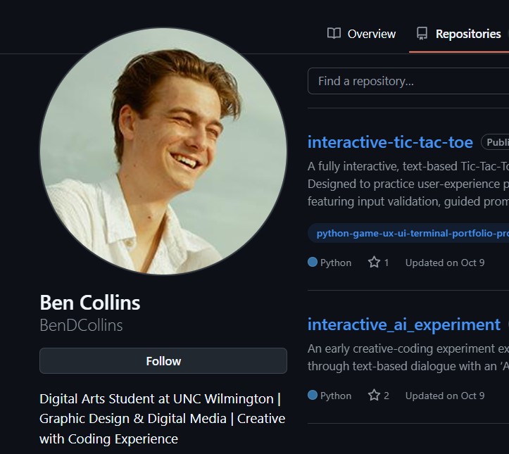
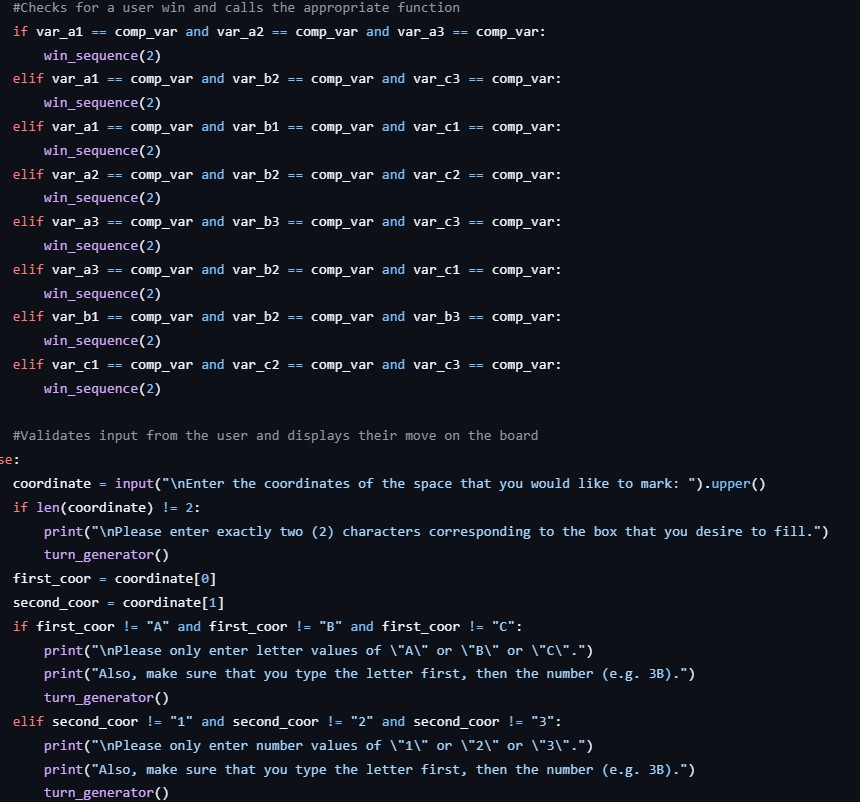
“Interactive Tic-Tac-Toe”
Micron pen on bristol board, digitally altered
A fully interactive, text-based Tic-Tac-Toe experience built from scratch in Python. It features a guided setup, custom symbol selection, and robust input validation — designed with user experience (UX/UI) principles.
Full GitHub Repositories available here
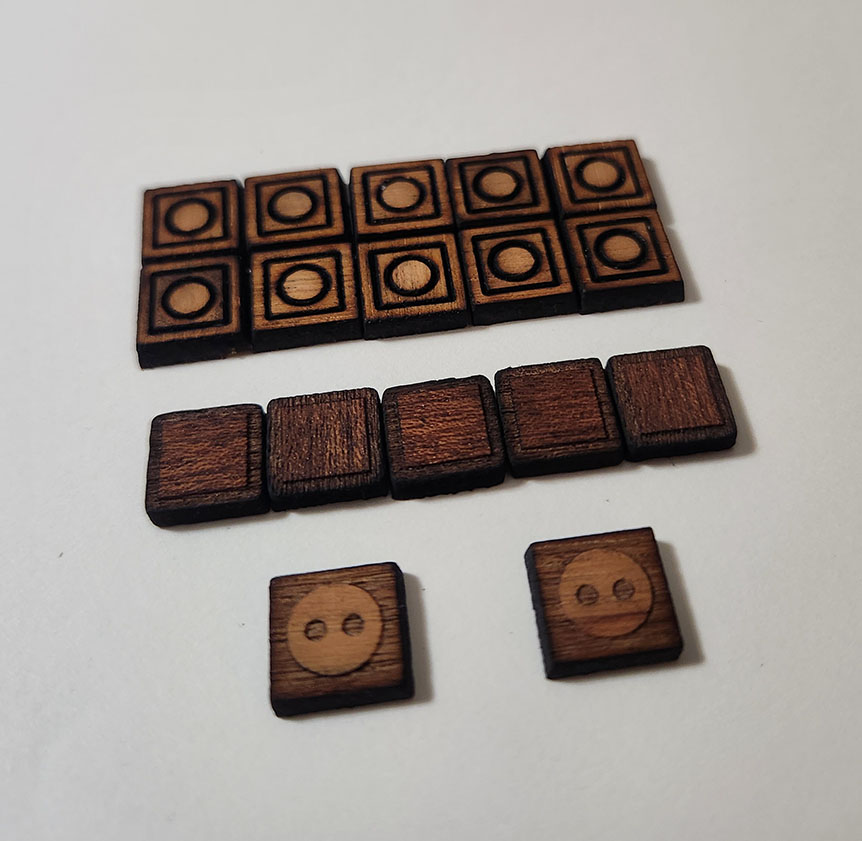

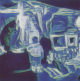
“Surveillance”
Laser Cut Cherry and Sapple Wood, Finishing Oil, Designed with Adobe Illustrator
A fully functional wooden board game designed in Adobe Illustrator and fabricated with the MUSE laser cutter. Rule sets created in collaboration with honors math students at the University of North Carolina at Wilmington.
Project reflection available here


“Chameleon Colors”
Self Portrait Photograph Digitally Altered
This digital design project focused on segmenting a self portrait and utilizing different color compositions for each. One color runs through each, re-contextualized by the surrounding colors but never changing. This is representative of the inextricable self which is re-contextualized and appears of a different quality depending on the situation, but is ultimately the same.
“Flickering Spirals”
Micron pen on bristol board, digitally altered
This variation of one of my artworks from “Line & Texture” has been digitally altered with a golden hue and a textural distortion. This gives it a shiny effect remeniscent of the gold leaf applied to ancient paintings. This drawing specifically was meant to look whimsical and to be looked at in detail from close up, just like these ancient paintings.
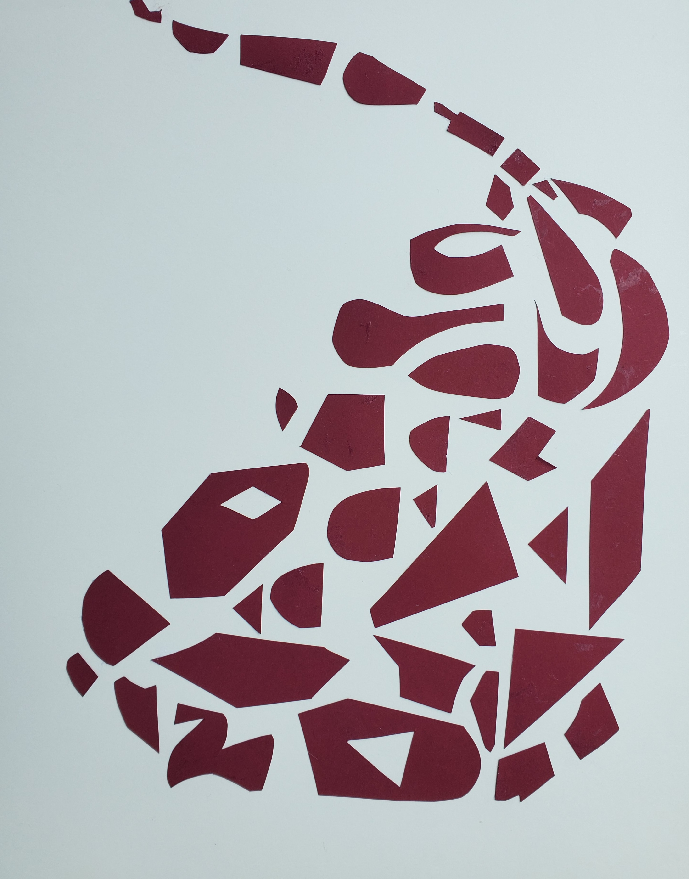
“Rotate” and “Drip”
Cut paper on bristol board
I attempted to represent abstract verbiage with physical paper, the words being “Rotate” and “Drip”. Each shape was composed of many smaller shapes which needed to interact well to create a unified whole. Many random shapes were cut first, ensuring that creativity and attention to detail would be required in assembling the final shapes.


Clotho, Lachesis, Atropos
Painted Gouache Artworks Woven Together, Micron Pen
This project combines two paintings into a weaving, representing both the front facing and the messy, complicated, behind the scenes aspects of life wrapped into one. It is named after the three fates and the tapestry of life that they weave. Two prototypes were created and one finished, totaling four paintings.
“One Man’s Trash”
Pure cardboard, digitally altered
Utilization of pure cardboard to create a larger-than-life, true to life model of a ladybug with pose-able legs and wings. Arranged with props, photographed, and digitally altered for effect.
“Colorcature”
Gouache painting
An examination of all of the main color palette combinations and varieties of tonal shifting and value difference. The creation of a unified whole despite each quadrant's different color composition.
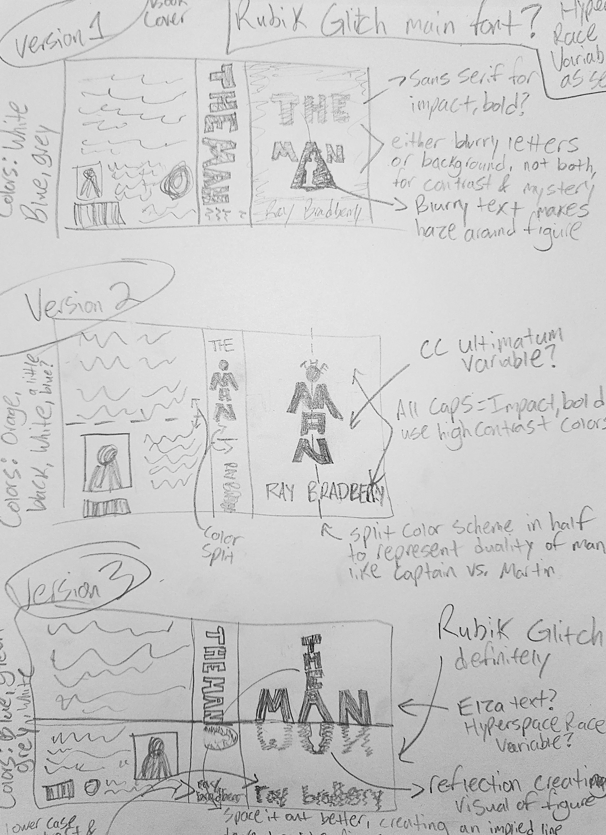
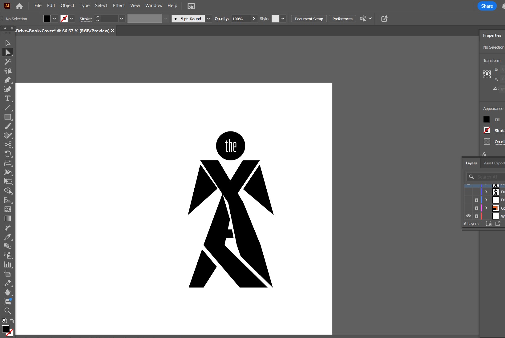
“The Man" Cover Design
Vector Shapes With Additional Imagery
I designed a custom book cover for the short story "The Man" by Ray Bradbury. I leveraged typographical manipulation to construct imagery out of the story title. I chose a high contrast color palette and composition to demonstrate themes from the story.
“This Looks Cool”
Cardboard, paper, fishing wire, digitally altered
This is a digital alteration of one of the frames from my project “Point of View”. There is no concept attached to this variation of the artwork, I just think it looks really cool. I suppose that is the concept: Sometimes inspiration causes a process of experimentation, and sometimes a process of experimentation causes inspiration.
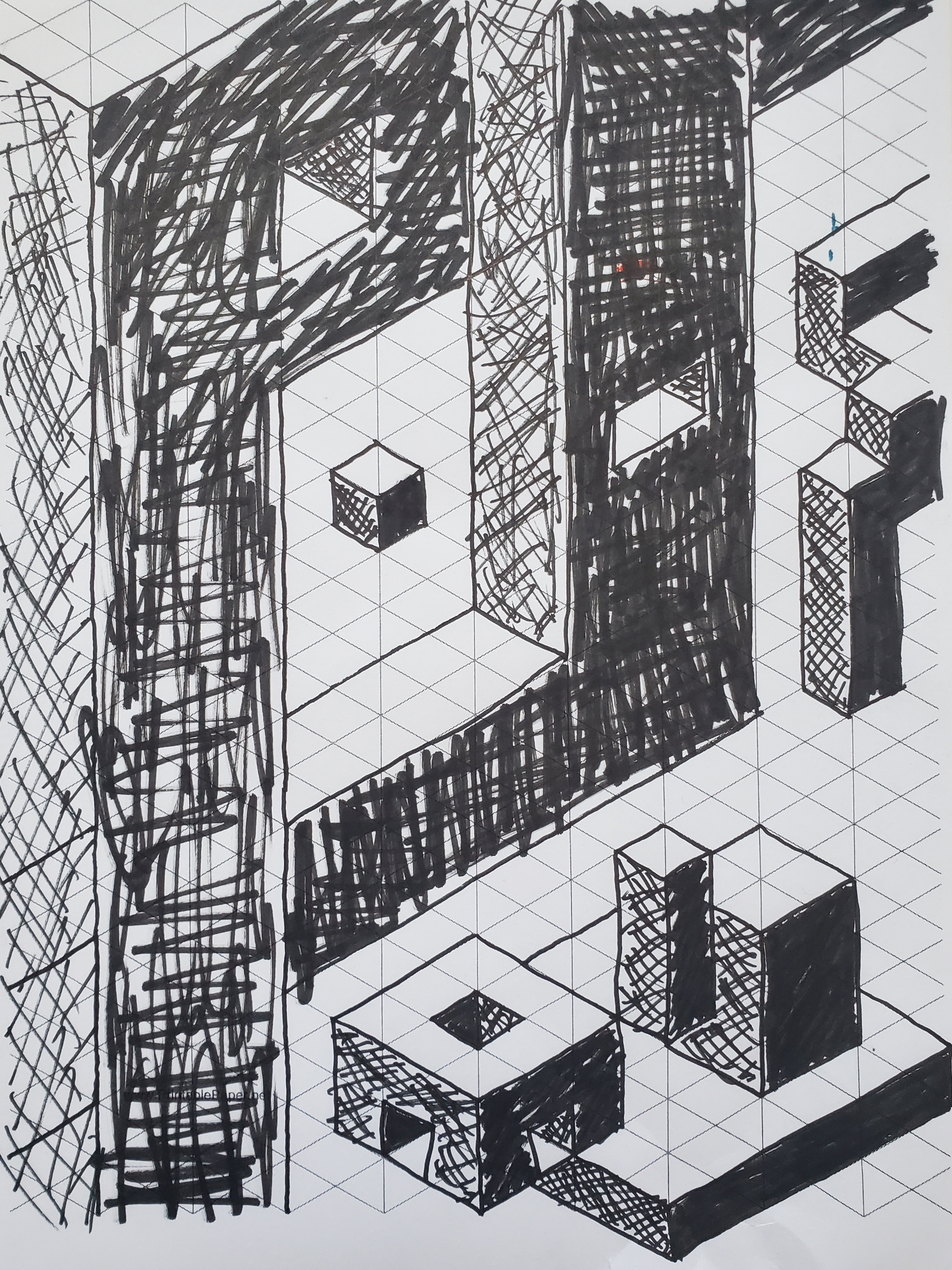
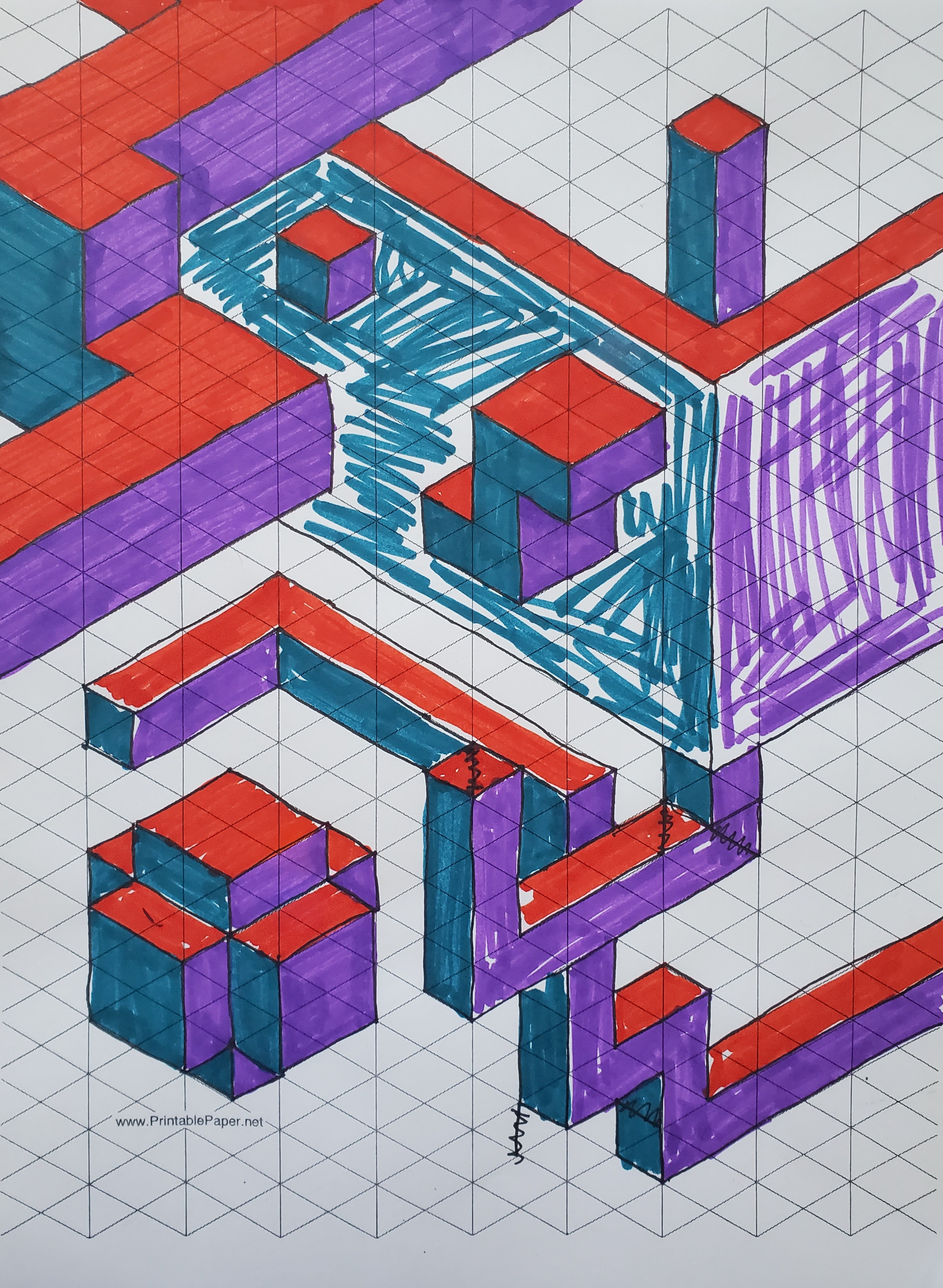
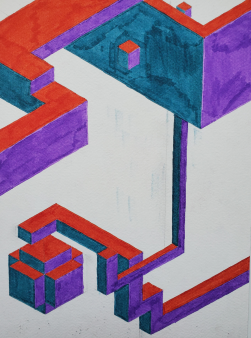
“Isometric Exploration”
Marker on both isometric paper and with rulers on plain paper
A study of isometric perspective over iterations, building an understanding of its functions, purpose, and nature. I also took inspiration from M. C. Escher and his artworks which defied laws of logic and space. Some of the shapes here could not be constructed literally, but look right at home in an isometric universe.
Wordpress Portfolio Website
Built with Wordpress, through Bluehost
I created this website to develop skills and familiarity with its interface, web hosting, HTML structure, and implementation of custom CSS. It hosts a select number of projects available here on my full portfolio website, and it explores alternative layouts and features which I may build here as well. Visit the website here

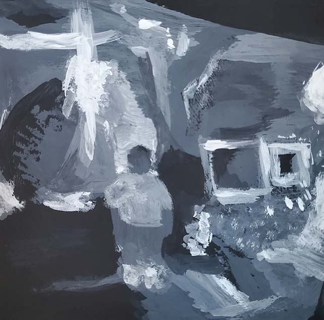
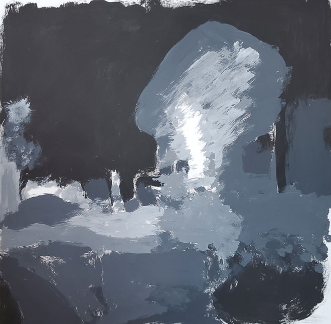

“Valuable”
Gouache painting
An project focusing on value and light. Pictures taken of a model at night I rendered in grey scale gouache while looking at the photo from the side so as to disconnect the object recognition part of my mind. Then a second round of paintings were created, now viewing the previous paintings upside-down and recreating the values.

"Zoom"
Card Stock, Colored Paper, Glue
A giant flip book constructed by hand out of cut paper and card stock. It explores the idea of a zooming perspective, whether from large to small or vice versa depending on which side of the book is opened first. Close attention was paid to scale, proportion, perspective, and storytelling to create a satisfying cycle of visuals.
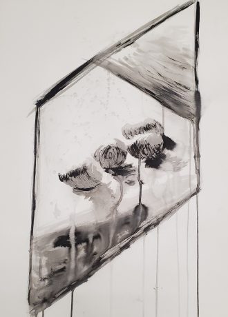
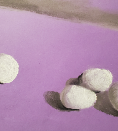
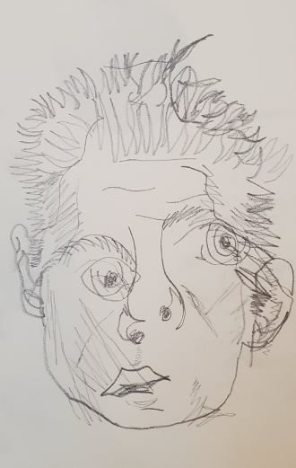
Runny Eggs
India ink, graphite, water
I chose not to fully outline my forms but instead to draw the dark values and to leave everything else blank, creating implied edges. I chose to slant my edges to create parallel lines between the frame and the row of eggs. I also chose to experiment with adding watery ink and spraying water strategically to create interesting shading patterns.
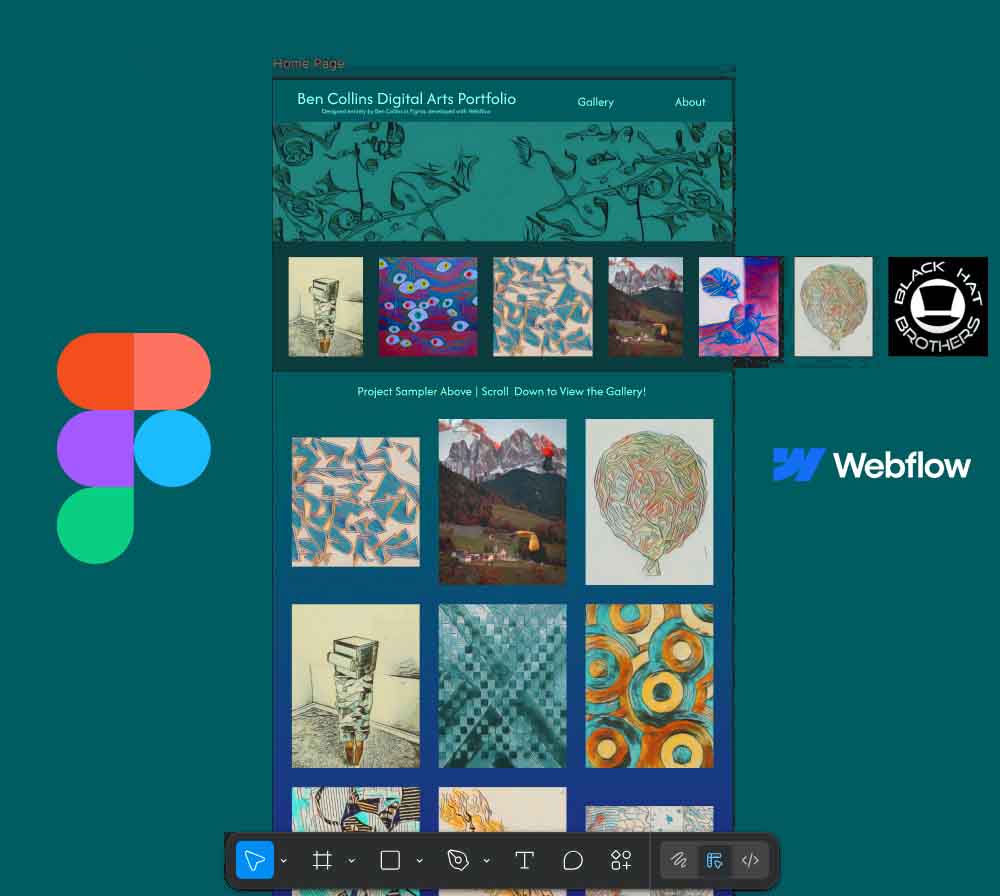
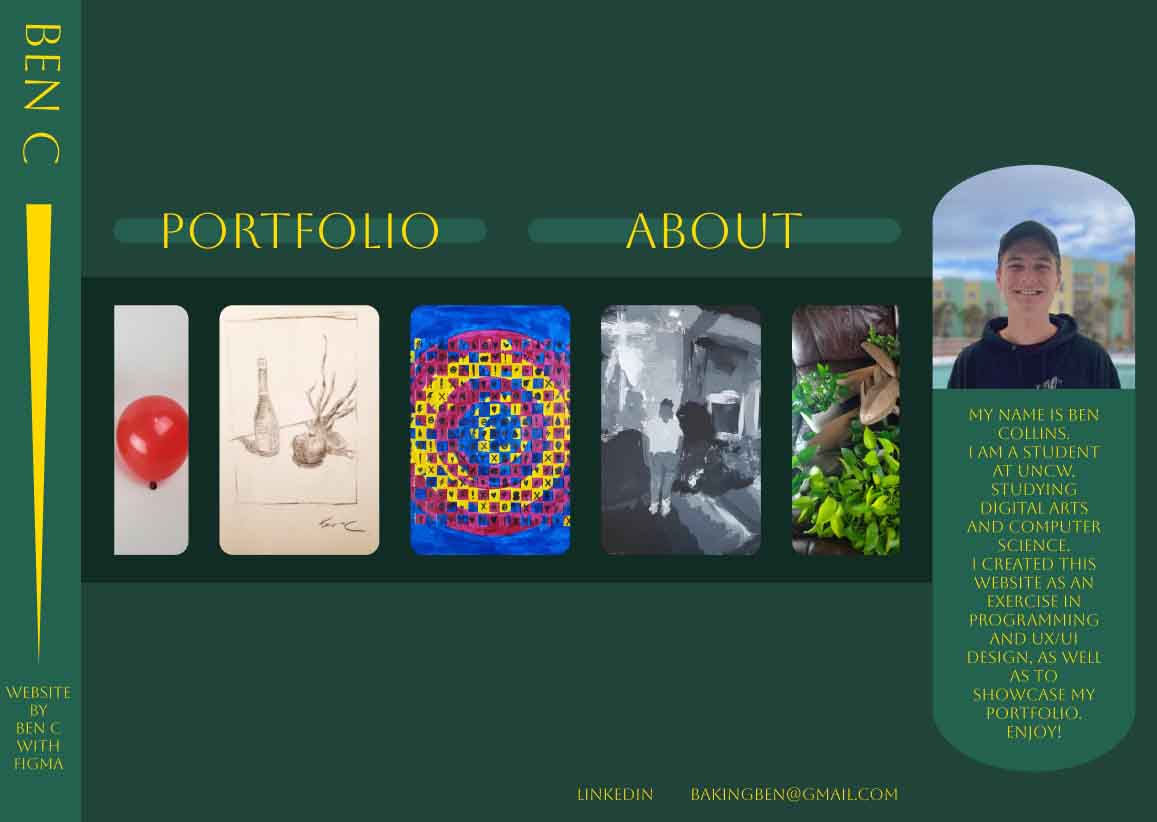
Case Study: Designing & Building My Portfolio Website
A self-initiated project exploring UX/UI design, structure, and iteration through Figma, Webflow, and real user feedback.
Role:UX/UI Designer & DeveloperTools:Figma, Webflow, WixTimeline:February – November 2025
Purpose and Intent
This project began as a way to create a home for my projects while developing real-world UX/UI and front-end design skills outside of class. My goal was to design a portfolio that felt personal, professional, and scalable. I needed something that could evolve as my skills and projects did.


Learning by Building
Before building the final portfolio, I explored multiple approaches to understand what worked—and what didn’t. My first Figma layout was an exercise in visual hierarchy and structure, while the Wix version helped me experience real interaction and usability for the first time. This second iteration was functional, but quickly became cluttered. It took practice to learn that more content doesn’t always lead to more clarity. Both versions were important steps that shaped my process and informed the final design.
Along the way, I began using AI tools as learning partners, not to build for me, but to guide my understanding of workflow and troubleshoot design and implementation issues efficiently. This practice helped me develop clearer problem-solving habits I could apply beyond this project.
“It’s easy to lose focus when you prioritize including it all instead of designing for intent.”
Rebuilding with Intention
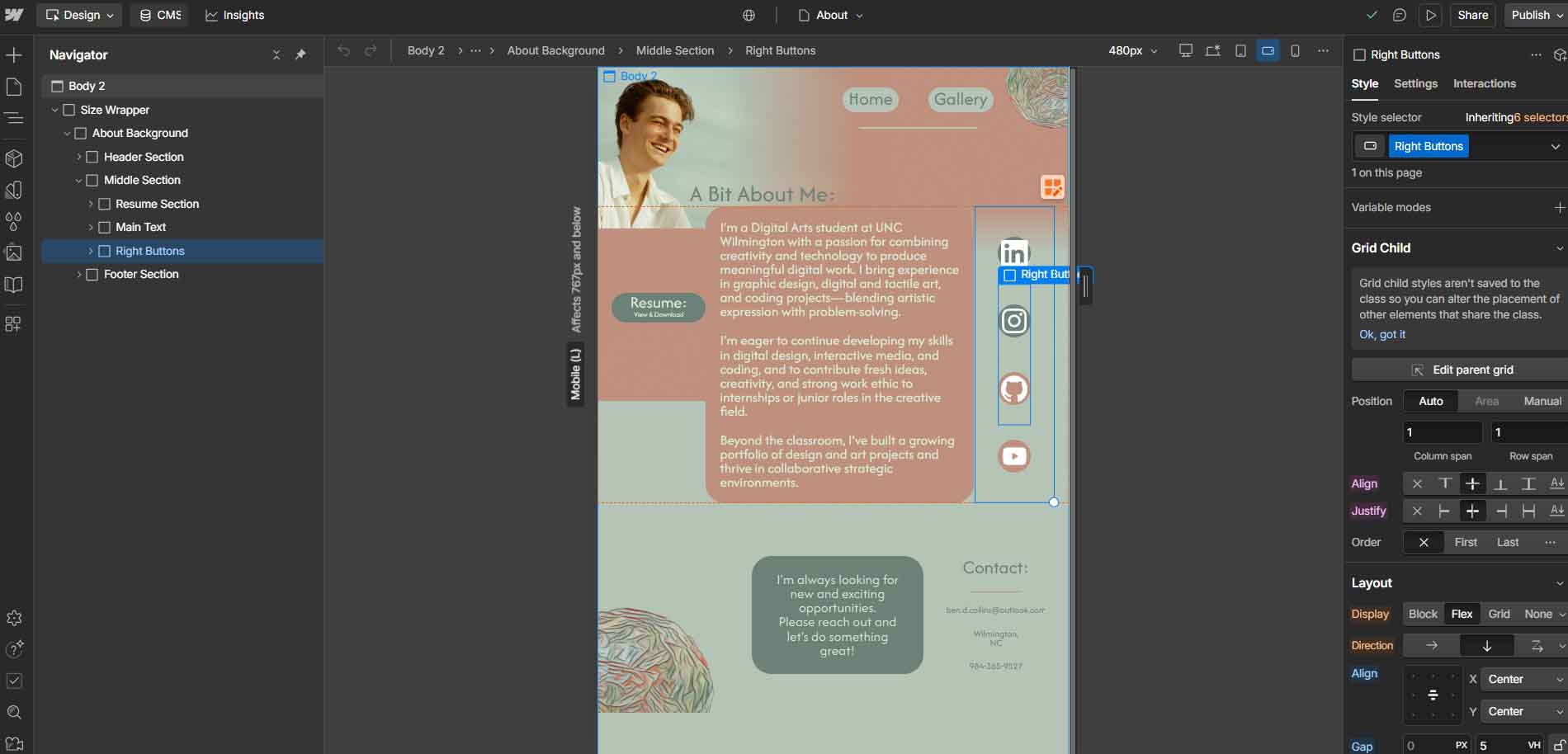
I went back to Figma to design a more structured and intentional layout. My goal was to streamline content and guide the viewer’s attention. When I discovered Webflow, I decided to rebuild my portfolio there to bring the design to life and learn responsive implementation.
What I didn’t realize at first was that I’d need to reconstruct nearly everything. Rebuilding in Webflow taught me how hierarchy, spacing, and component relationships translate from design to real interaction. It also exposed gaps in my initial approach: I hadn’t been designing in auto layout or planning for responsiveness.
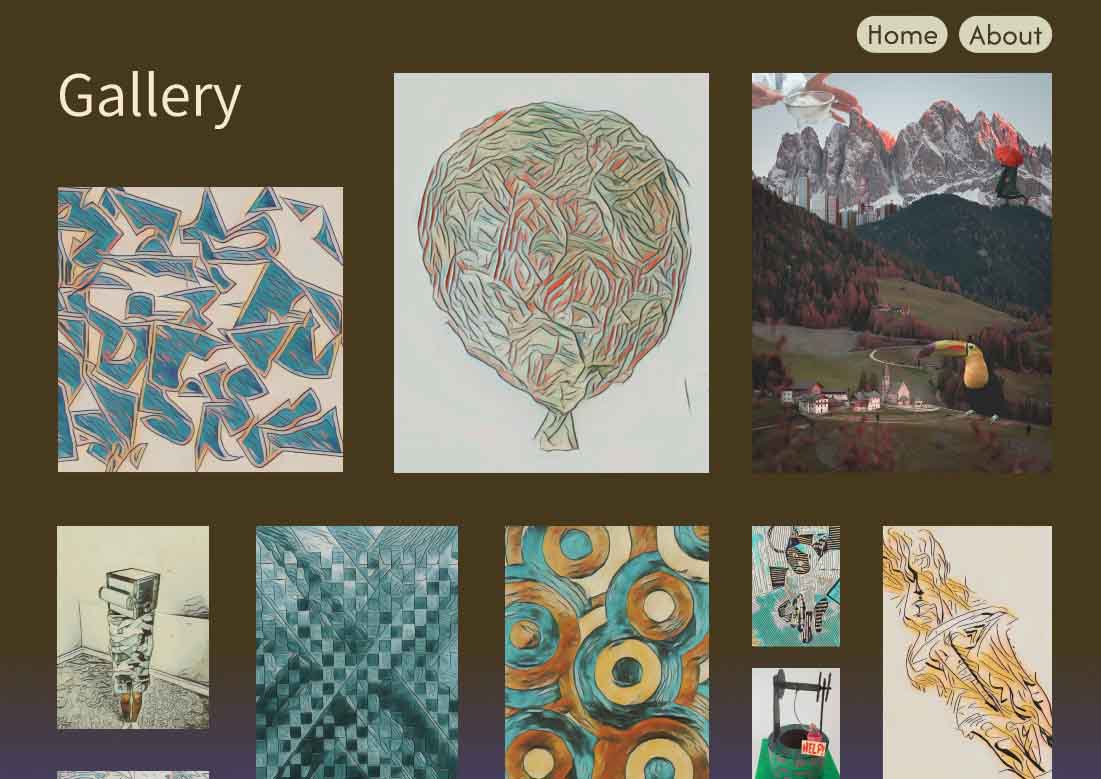
As I worked through the rebuild, I began trimming unnecessary content and simplifying navigation. Webflow’s two-page limit unexpectedly helped: it pushed me to merge sections, combining my gallery with my homepage. This change reduced friction and made the overall experience more intuitive.
Wix
Figma
Original
Figma Redesign
Current
Lesson Learned: Constraints can sharpen focus. Simplifying structure made the experience stronger
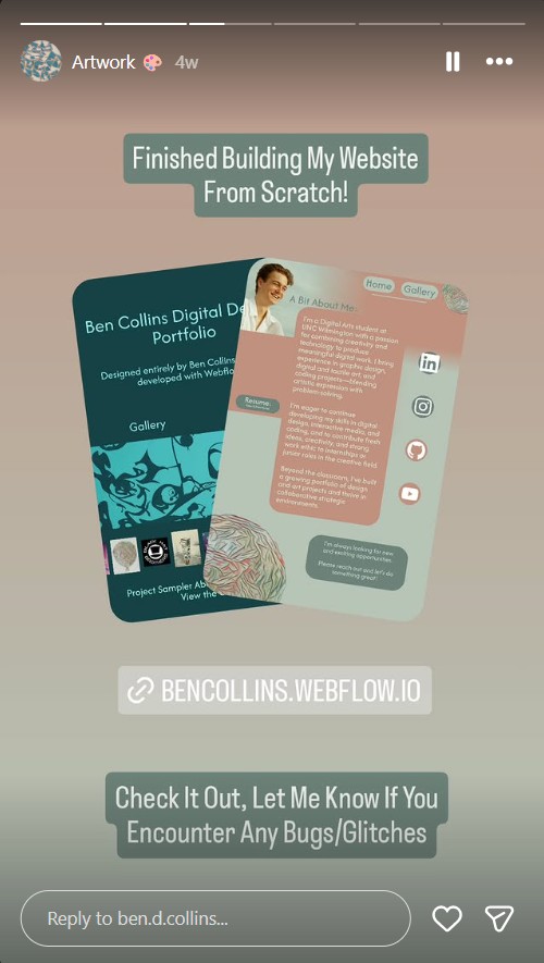
Designing Through Feedback
Once the site was functional, I began sharing it with friends, family, and peers for feedback. I also posted my work on Instagram and connected with a UX designer on LinkedIn, who gave me a focused 10-minute review. I also utilized a public poll to guage user sentiment on potential artwork that I would use in association with the website (which I had created in Adobe Illustrator).
That session helped me fix responsiveness issues across devices, refine my visual hierarchy, and test how users naturally navigated the layout. The experience reinforced that external critique isn’t a luxury. It’s a vital stage of the design process. Some issues I hadn’t even noticed became obvious when I watched others use the site.
I used social media platforms to drive real users to my website, aiming to collect genuine interaction data and feedback. This process helped me understand how audiences navigate and respond to my work.
I connected with a professional UX designer on LinkedIn who offered personalized feedback on my portfolio. Based on their insights, I restructured elements for cleaner responsiveness and refined the hierarchy of my pages to better align with my target
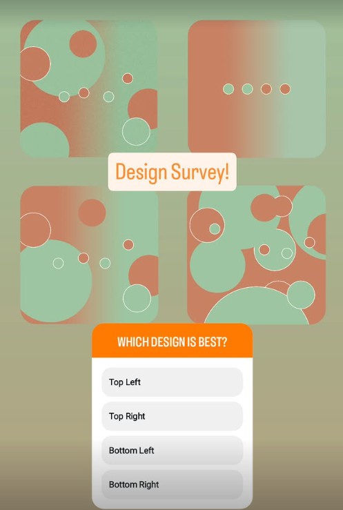
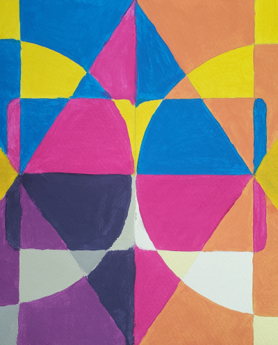
I designed a series of personal visuals, experimenting with different layouts and gathering feedback through a public poll. The final artwork establishes a consistent visual identity through a recognizable color palette and geometric theme.
“A trial period of feedback isn’t just a finishing touch. It’s a critical step.”
The Final Product
Outcome: A personal website that clearly communicates my work while showcasing my ability to design, iterate, and implement across tools.


Final Design: Achieved a simplified structure and refined hierarchy
Reflection
This project started as a way to learn tools, but it became a full UX exercise. I got to experience the full scope of a user centered design process, from early exploration and iteration to real implementation and user feedback. Rebuilding the same site multiple times challenged me to balance creativity with structure, and to keep refining until the design matched the intent.
I plan to continue adding case studies and projects to this website as I polish and refine details over time. One of my favorite parts about UX/UI designing is that the product should adapt for existence in a changing world with changing user needs.
This project reminded me that design isn’t just about how something looks, it’s about how it works, grows, and communicates.
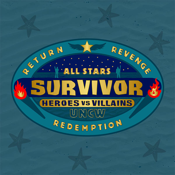
Survivor UNCW All-Stars: Experience Design & Art Direction
Designed and delivered a cohesive visual system for a live competition series under a 3-week timeline and significant budget constraints, spanning branding, apparel, props, and physical environments.
Role:Art Director & Experience DesignerTimeline:December 27 – January 17 (3 weeks)
Tools:Adobe Illustrator, Physical Prototyping, FabricationScope:Branding, Graphics, Apparel, Props
The Challenge
Survivor UNCW launched its first-ever All Stars Season with only three weeks of runway and no established visual system.
As Art Director, I was responsible for designing and delivering a cohesive experience that would scale across digital and physical touchpoints, from branding and apparel to props and immunity idols, while staying production-ready, on budget, and aligned with the board’s vision.
This wasn’t just about making things look good. The visuals had to support optimal gameplay, communicate theming, and make the season feel climactic and professional under real constraints.
Project Constraints
Design Strategy
Rather than designing individual assets, I approached this as a design system problem.
- The All-Stars season needed to feel premium, climactic, and unified.
- Ocean theme to signal scale and finality
- Star iconography to reinforce “All-Stars”
- Dolphins (Heroes Tribe) and Sharks (Villains Tribe) to show contrast with shared DNA
- Color system reflecting UNCW branding, adjusted for flexibility and copyright safety
- Every design choice carried intent:
- Starfish Motif → “All-Stars” + ocean identity
- Hidden idol references in buffs → narrative cohesion
- Crest T-shirt design → legitimacy & pride
- Material Choices → tactile weight and solidity for impact
- Prioritize speedy fabrication
- Build durably for gameplay and outdoor environments
- Think towards scalability across mediums
- Remain cost-conscious and communicative
“I designed a system, not just assets.”
Iteration Process
Sketches → Iteration → Feedback → Fabrication → Deployment
Board meetings clarified theme, tone, and priorities. I gathered constraints and reference points. This defined production requirements

I sketched ideas and mapped
symbols to bring a cohesive
vision to the board. After
constructing mock-ups, I
presented to the board and
pivoted original school colors
to more paletable and unique
variants, prioritizing a golden
sheen throughout the design
and including additional
texture work and decorations.


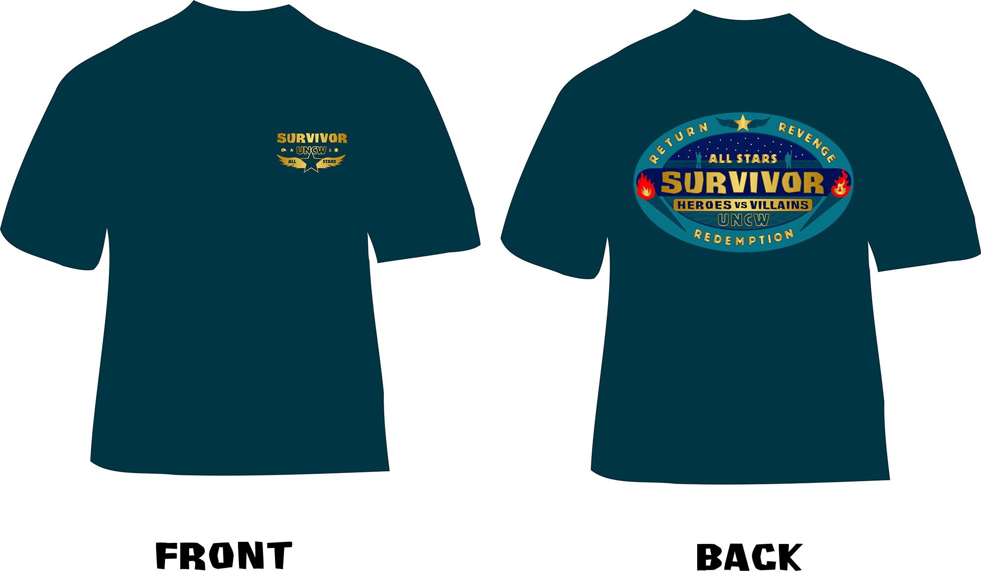
I carefully created a T-shirt design
with the goal of including maximum
season theming and detail
while preserving casual wearability.
I designed a minimalist crest for the
front of the shirt, seeking to evoke
an authorotative badge of honor
in reference to our "All Star" theming.
I reproduced this design in multiple colors
and considered adding club member
names to the back. In the end, through
feedback and collaboration with the
board, the sleek black design with the
original backing was chosen enthusiastically.


%20-%20JPG.jpg)


It was a hectic few weeks accumulating,
assembling, and polishing each physical
item. I prioritized durable materials, attention
to detail, and a cohesive color and texture
palette across it all. Feedback loops with
advisors and the board allowed fast iteration
while keeping momentum.


“Every iteration needed to balance clarity, meaning, and manufacturability.”
Key Deliverables
As a result of solid prep work, excellent communication, and dedication to quality, all deliverables were designed, fabricated, and delivered on schedule and within budget:
Season logo, Color system, Buff designs (3), full T-shirt design, Tribe flags, Immunity idols (3), Individual immunity necklaces (2) Tiki head immunity prop, Tribal voting urn, Foam ceremonial torch


“All deliverables were designed, fabricated, and delivered on schedule and within budget.”
Impact & Reflection
My final project impact can be summarized as a few key pillars:
I delivered the entire experience system on time. I kept total production costs under $150 through strategic sourcing and fabrication. I received enthusiastic feedback from board and players. I Established a scalable visual foundation for the season. Finally, I elevated the perceived quality and legitimacy of the competition. I was able to accomplish all my key project goals, while adapting to stakeholder requests and adjustments. My key project takeaways were practicing how to:
“Flora and Fauna”
India ink, graphite, salt
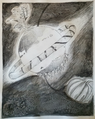
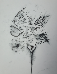
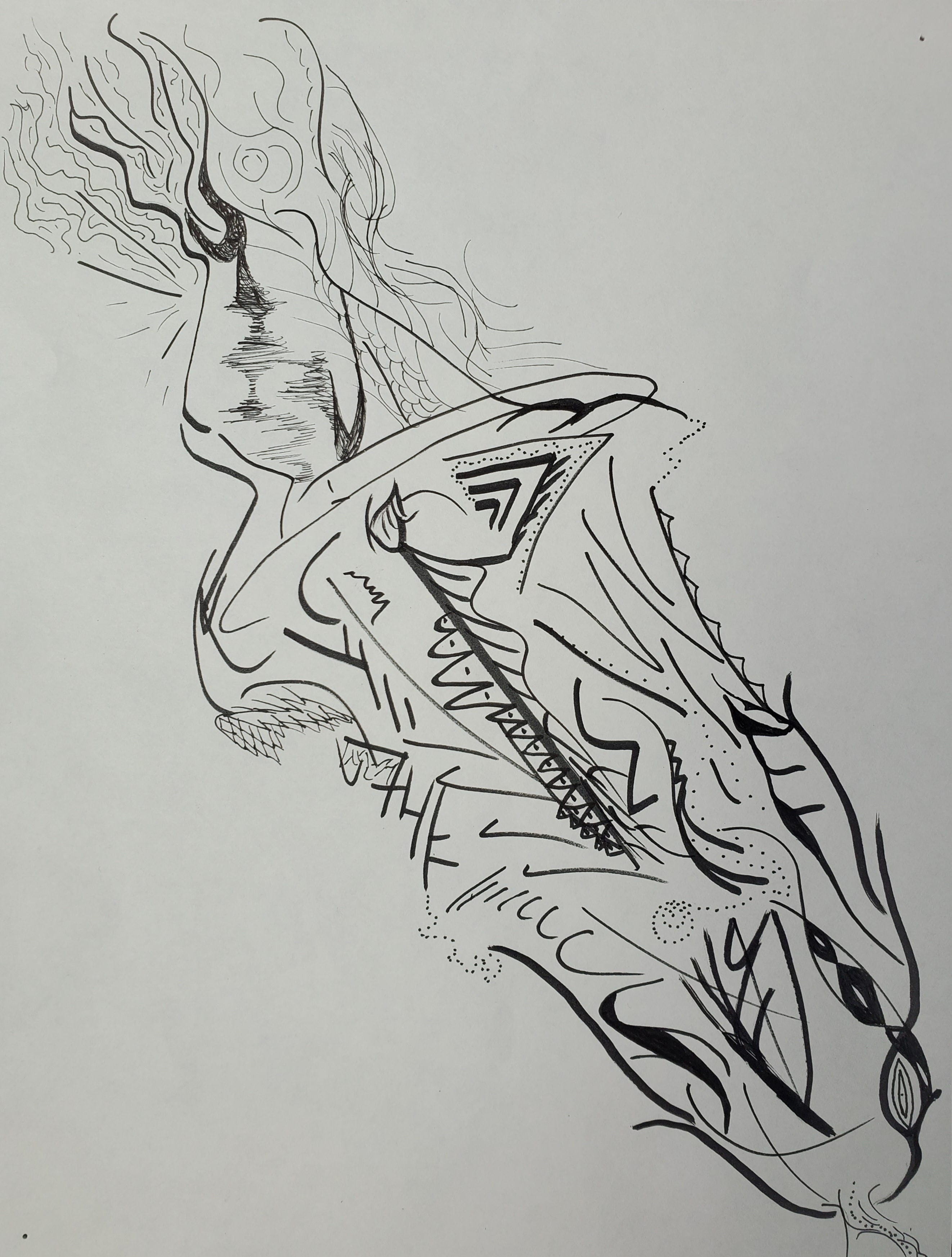
This artwork is full of strange and fun concepts which I greatly enjoy. I was tasked with combining surreal flora and fauna in a way that was almost acceptable but not quite. I combined ink and graphite to create a space and atmosphere effect, while using salt during the drying process to create ‘stars’.


“Oh, The Humanity!”
Graphite, charcoal, india ink
A collection of drawings of the human form and still life scenes. I grew tremendously in my ability to render proportion, value, perspective, texture, anatomy, geometry, and atmosphere while creating these drawings.


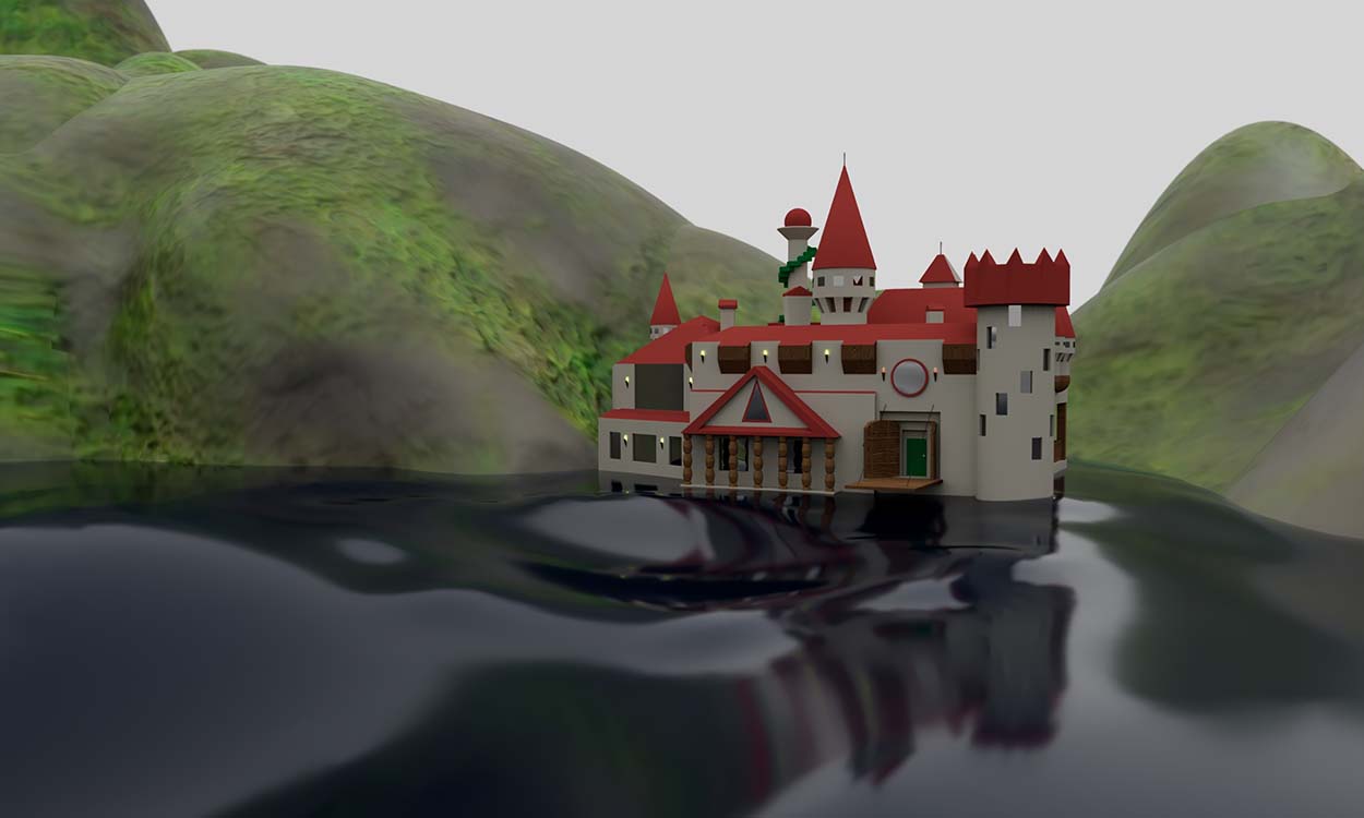
“Mimic”
Paper mache, plastic bags, cardboard, marker, paint, digital alterations
The replication of everyday objects and materials through unexpected or contradictory means. An attempt to challenge the visual assumptions made and remind us of how little information we often build assumptions upon. One image digitally altered to create visuals for this website.
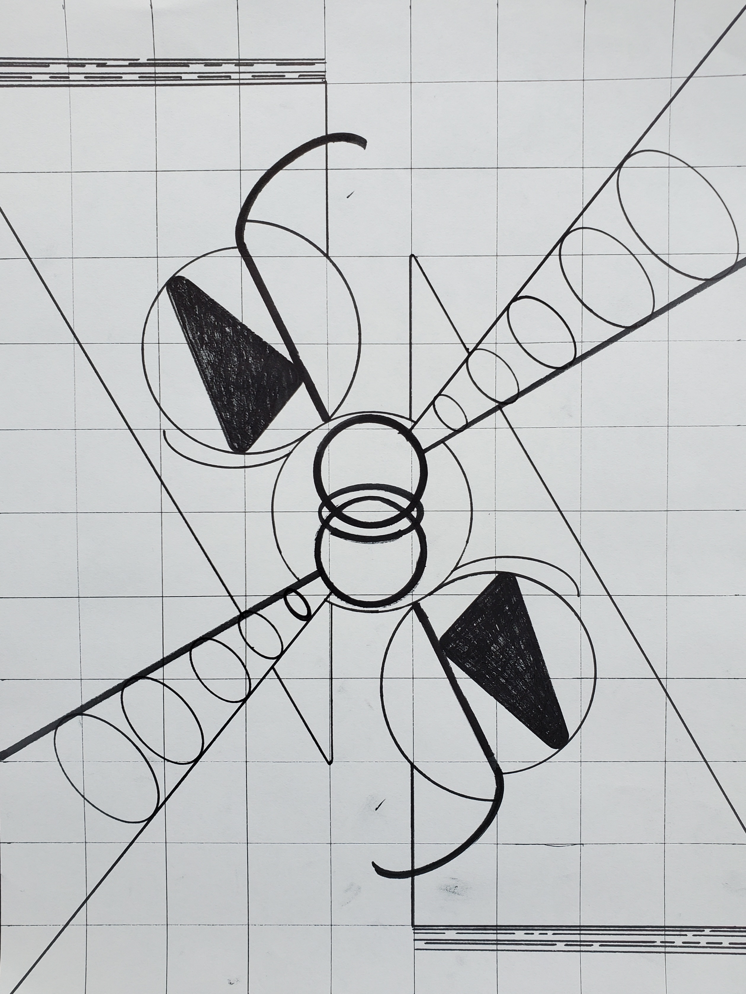
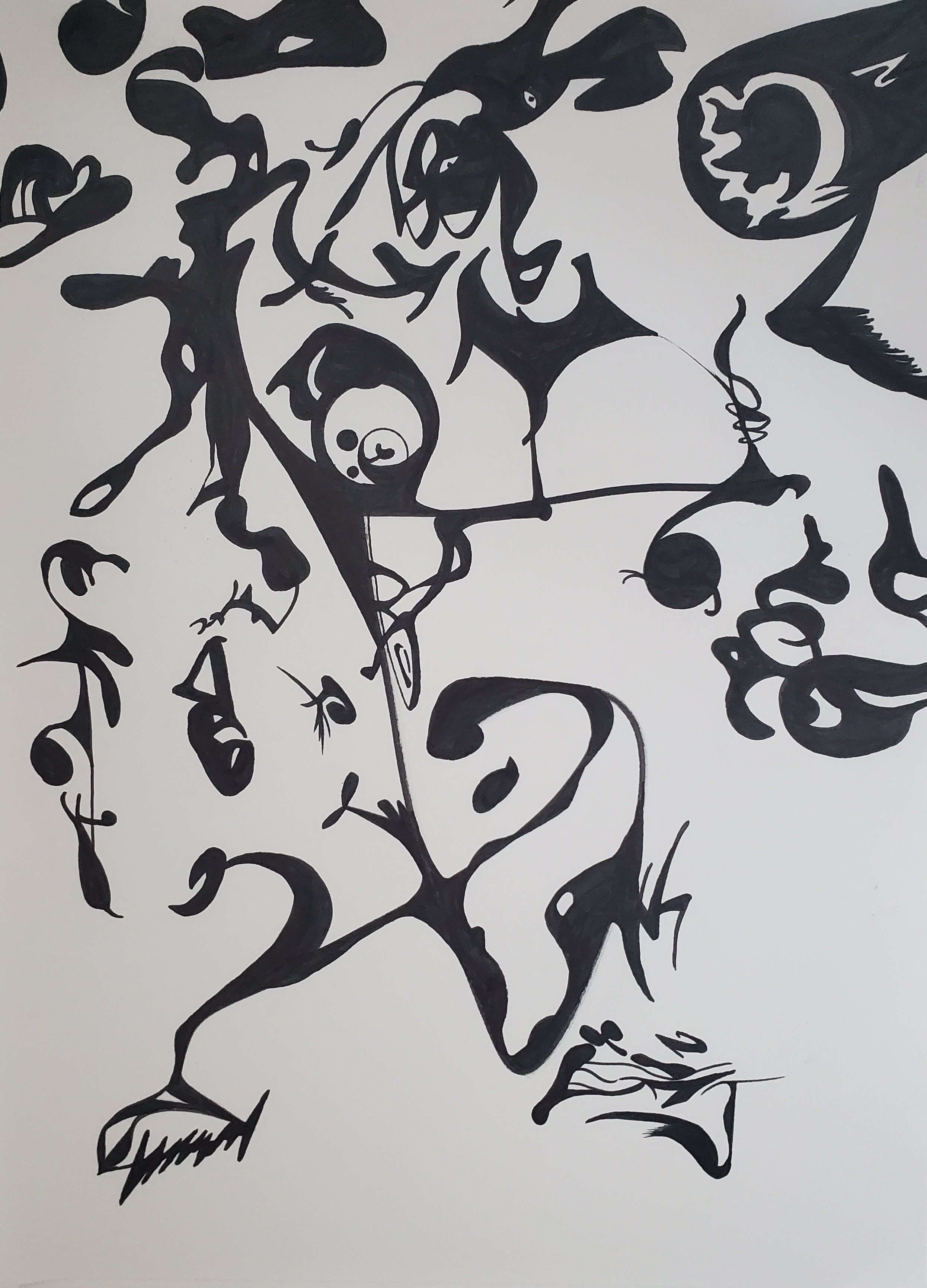
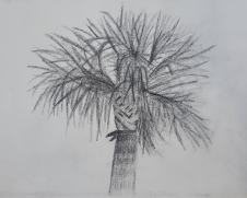
“Line & Texture”
Micron Pen on Bristol Board
This series of drawings were produced during two-dimensional design class to explore various line textures and styles. I continued producing these in my own free time as practice in line-work, creative liberty, finding my own style, and letting go of some self-expectation.
Brand Design & Editing
Artwork in Adobe Photoshop, Video editing in Shotcut
I edited and branded this YouTube channel for years, gaining experience in adobe photoshop and video editing. I do not take credit for this logo itself. It was assembled for non-commercial purposes. I use it as a representation of the branding and design skill that I built through managing this channel
Channel available here
“Survivor UNCW Artwork”
Vector Graphics in Adobe Illustrator
As the art director for Season 5 of UNCW Survivor, I worked within constraints set by the board to design logos, materials, and set decor in line with the colors and themes of the season. I designed and curated logos, buffs, shirts, flags, necklaces, props, immunity idols, and more. I am currently compiling a case study on this, for now here is a sample of my graphic design work.
“Wanted!”
Stop Motion Animation with Cut Paper
This stop motion video was made with rudimentary means, entirely out of cut paper and resources available during studio art class. This helped build skills in motion, animation, visual distortion, framing, and anticipating needs such as transition frames, duplicate images, and props. Video available here
Project Archive
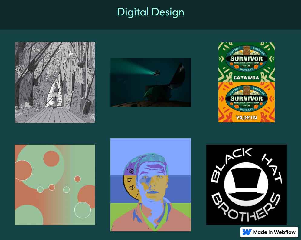
A growing catalogue of all projects outside of the main gallery. Categorized for browsing, collected to show growth.